
Posted on February 26, 2024 by KylieMawdsley
SHADES OF BLUE & GREEN (& TEAL) FOR ANY CABINET
We all know that painting cabinets white is the most timeless and popular choice. But based on current trends, blue and green are making a run at the title – especially on kitchen islands and bathroom vanities.
Why?
This post may contain affiliate links. If you make a purchase through links on our site, we may earn a commission.
It’s easier to commit to something a bit different and ‘out of the box’ on a smaller scale vs. a large-scale project like an ENTIRE KITCHEN, which can be costly to redo in five years if you’re tired of the color (or five months if you’re like me). Even then, I’ve had many Online Color Consulting clients ask for bold blues and gorgeous greens to grace their whole kitchen—and I’m on board (most of the time).

However, not every space can handle color, and a more safe but still stunning shade of neutral is a better choice. It’s important to a) read carefully, b) sample carefully and COMPARE colors, and c) choose the color that best suits your surrounding finishes, even if it’s not the first color you had in mind.
If you want to read about the pros and cons of colorful cabinets and islands, check out this blog post (rather than me being repetitive…like usual).
Now let’s see what I’ve got up my colorful little sleeves…
THE 8 BEST GREEN COLORS FOR VANITIES, CABINETS, OR ISLANDS
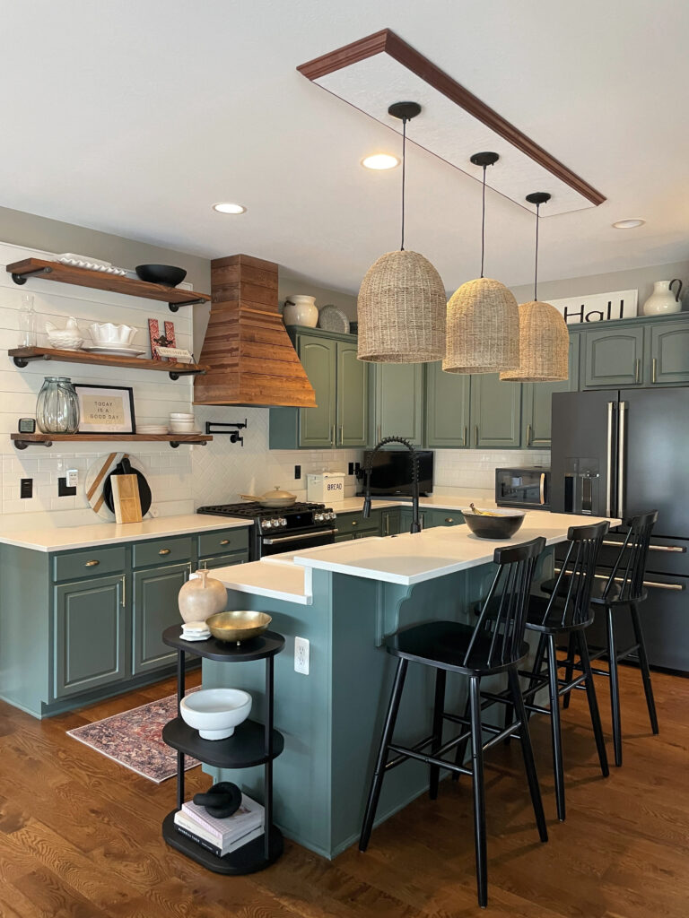
Whether it’s a green-blue blend, emerald-inspired, or leaning into the mossy or olive end of things, green is definitely one of today’s more popular kitchen cabinet colors! And while some homeowners are choosing more moderate, slightly sage-inspired shades, TONS are opting for the darker end of things…
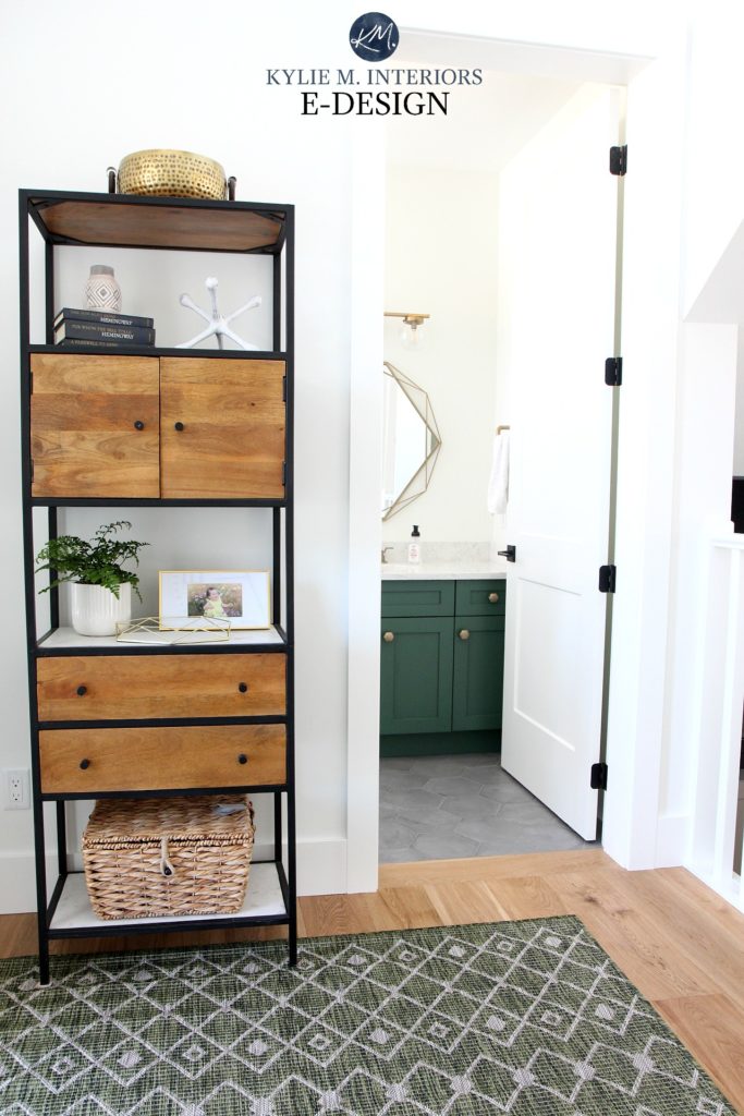
1. SHERWIN WILLIAMS ISLE OF PINES 6461
Isle of Pines is a gorgeous green (pines is also a great anagram – yes, welcome to my brain). While it winks at the Kelly Green end of things, it’s not as intense and is more emerald-inspired.
A color like Isle of Pines could overwhelm an entire kitchen if the space isn’t carefully planned around it. However, a white kitchen with a gorgeous deep green island can be a striking way to add a pop of color without overcommitting.
However, if you’re nervous about ‘too much color,’ Isle of Pines could seem intimidating. In this case, you might want to try a different approach to green…
2. SHERWIN WILLIAMS RIPE OLIVE 6209
Ripe Olive is a dark shade of green with a rich undercurrent. When it comes to cabinets, Ripe Olive offers a commitment to green without going anywhere NEAR Kelly or Emerald Green.
As shown in this next kitchen, Ripe Olive’s LRV of 6 is striking with off-white quartz countertops. And sure, you see GREEN, but it’s not punchy…
If you love Ripe Olive, I HIGHLY recommend comparing it to the shades in my CURATED DARK, WARM GREEN COLOR BUNDLE – you never know which one you’ll choose!
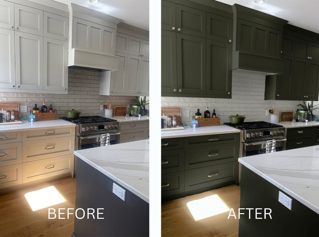
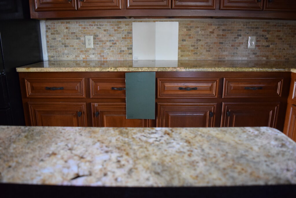
3. BENJAMIN MOORE SALAMANDER 2050-10
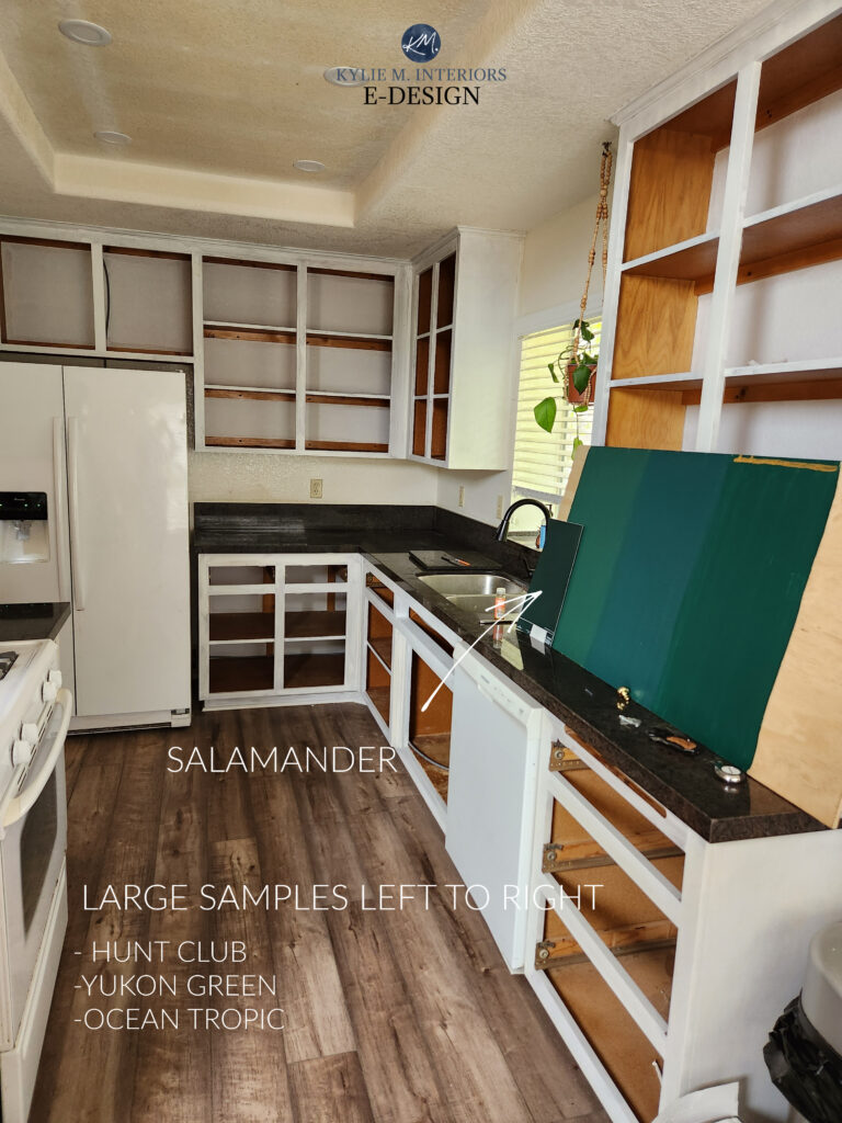
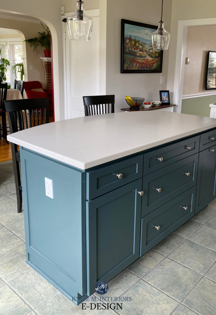
Salamander is one of Benjamin Moore’s most popular green paint colors for kitchen cabinets, color-washing, and front doors. This dark shade of green has a slightly cool tone (green-blue) and a reasonable saturation, meaning it’s not just dark (with an LRV of 5.72 ), but it’s also reasonably colorful. In fact, Salamander almost made the cut for the ‘teal’ section (coming up shortly), but it’s a bit too committed to its green hue for that.
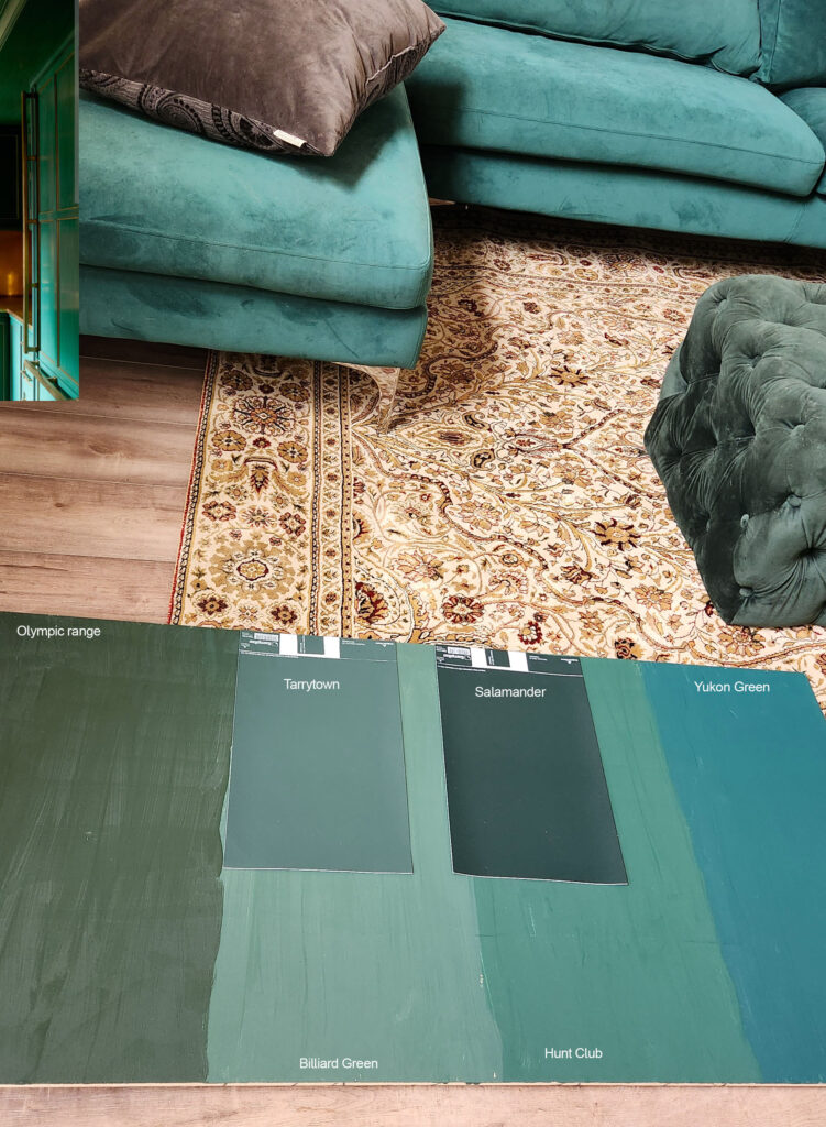
While this shows all the colors, they SHOULD be vertical, not horizontal.
Remember that you should never pick paint colors based on how they look horizontally or at an angle. ALWAYS place them 100% vertically so you can see how the light (natural and artificial) bounces off them.
Here’s Salamander and a few other popular shades of green (again, they should be totally vertical)…
The Best Medium & Dark Green Paint Colors
If you love these cooler shades of green, I’ve got others that are worth sampling and comparing in this CURATED COOL GREEN COLOR BUNDLE (I have Color Bundles for EVERY color group/depth – just holler if you want the link to one I haven’t mentioned!)
4. BENJAMIN MOORE CALDWELL GREEN HC-124
If you can’t decide between dark green, sage green, or light green cabinets – how about Caldwell Green? This medium-depth shade of green has a slightly cool backdrop but all the glorious green a girl could ask for.
My next client updated their early 2000s kitchen with painted green cabinets (Caldwell Green), white quartz countertops, subway tile, and a few other cute and funky additions to give it a whole new personality…
With an LRV of 16.27, Caldwell Green is at the soft end of the medium-dark range—not dark enough to even WINK at black, but not so light that it gets mistaken for sage.
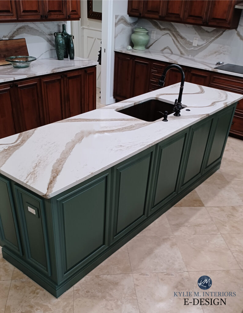
5. BENJAMIN MOORE VINTAGE VOGUE 462
I don’t know about ‘vintage,’ but this shade of green sure is ‘en vogue.’ Vintage Vogue is a stunner. Found in Benjamin Moore’s Classic Collection, Vintage Vogue commits to green without hitting you upside the head with it. With an LRV of 11.85, this shade has reasonable depth, winking at the dark world, but enough color to show up to the party – tassels and all.
In this next photo, notice how Vintage Vogue’s slightly cool look grabs the green tiles in the travertine mosaic tile backsplash. A connection like this makes Vintage Vogue a gorgeous option for the island. However, given the degree of gold in the countertop, it could be overwhelming for the WHOLE kitchen.
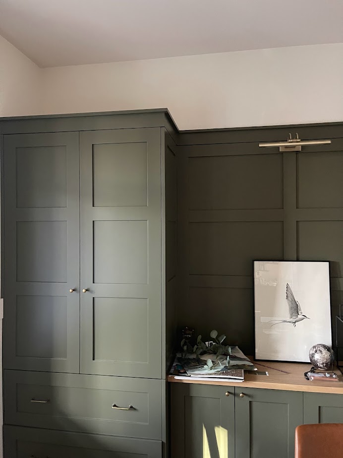
6. BENJAMIN MOORE DARK OLIVE 2140-30
Dark Olive is one of my favorite shades of dark green. With minimal commitment to being warm or cool, Dark Olive’s grounded neutral base calms it down while still leaving one heck of a nice moody, slightly organic hue on your cabinets, island, or vanity.
Similar to Dark Olive
Dark Olive has an LRV of 13.52. This number tells us that Dark Olive is in the medium-dark range, with a bit more oomph than some of the lighter shades shown above. With its flexible base/degree of color, Dark Olive often suits a range of older-style granite and laminate countertops and looks stunning with butcher block.
Because comparison is the most important part of choosing your best paint color, compare Dark Olive to Sherwin Williams Ripe Olive. Notice how Dark Olive appears a bit lighter and is a bit earthy and warmer in comparison.
7. SHERWIN WILLIAMS BASIL SW 6194
Right up there with Isle of Pines in ‘degree of green,’ Basil is great for those who want to commit to green without winking at the primary world (like Isle of Pines can). This dark green isn’t messing around – it’s green, but it’s tempered by a soft gray base, slowing it down and grounding it a bit.
You’ll also notice that Basil is lighter than Isle of Pines. With an LRV of 15, Basil sits more moderately in the med-dark world. A great comparison with Basil is the previously mentioned Benjamin Moore Caldwell Green. Both shades have a similar depth, but Caldwell Green holds a bit more gray than Basil, showing you two great versions of a similar approach.
8. SHERWIN WILLIAMS EVERGREEN FOG 9130
This is definitely the lightest of the bunch, but I couldn’t NOT mention it – it’s so stinkin’ pretty!
If you’re looking for a more subtle take on green, Evergreen Fog is a medium-depth green with just the right amount of gray to calm it down without taking away the ‘green’ of it. As for temperature, Evergreen Fog doesn’t lean overly warm or cool, giving off a more ‘smoky’ look.
Paint Color Review of Sherwin Williams Evergreen Fog
While the above photo doesn’t show Evergreen Fog on a kitchen island or vanity, it gives you a great idea of how it can settle in a space.
A FEW MORE GORGEOUS GREENS TO EXPLORE…
- Sherwin Williams Grizzle Gray – a gorgeous green-gray blend (REVIEW)
- Sherwin Williams Pewter Green – more green than Grizzle Gray with a slightly cool backdrop (REVIEW)
The 15 Best Medium to Dark Green Paint Colors
THE 6 BEST BLUE PAINT COLORS FOR ISLANDS, VANITIES, & CABINETS
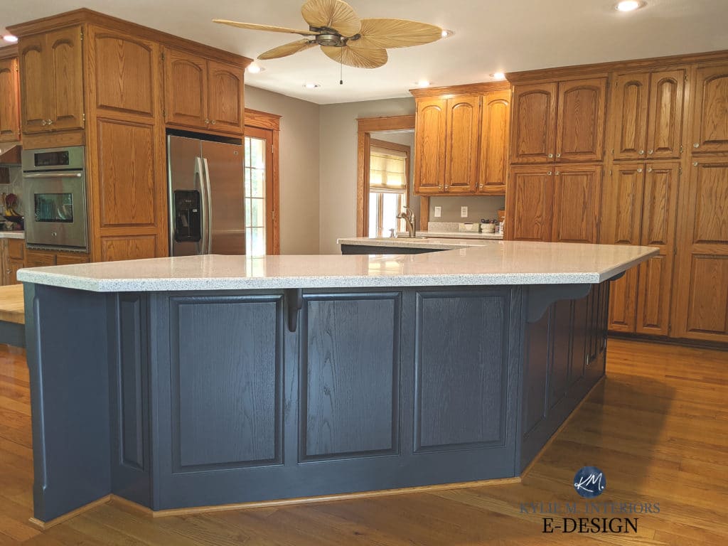
When it comes to my Online Color Consulting, navy blue is definitely the top color choice for painted islands and lower cabinets. However, even more moderate shades of blue make the cut. This is because blue is seen as classic, timeless, and by some…as neutral (which it isn’t; it’s a color, just flexible like a neutral).
While there are ALWAYS exceptions, in order to paint your island or cabinets blue, your kitchen would ideally have the following:
- white or wood cabinets
- a countertop that has blue in it or is white/gray (marble look)
- has colors in the countertop that would benefit from a blue accent (there aren’t many, but they’re out there!)
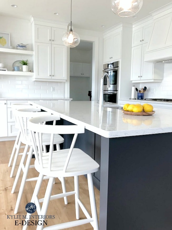
See more of this project HERE
1. SHERWIN WILLIAMS CYBERSPACE SW 7076
You can talk all you want about Benjamin Moore Hale Navy (coming up next), but it’s Cyberspace that has my heart. Cyberspace is a dark shade of blue; however, unlike Hale Navy, which is a bit more ‘committed to its color,’ Cyberspace offers a more muted, slightly smokey approach to the navy.
Shown above and below, Sherwin Williams Cyberspace
FULL Paint Color Review of Sherwin Williams Cyberspace
2. BENJAMIN MOORE HALE NAVY HC-154
As mentioned above, Hale Navy has its followers. And you might be one of them if you want a dark shade of blue with a bit more meat on its bones. Hale Navy is a dark navy blue with an LRV of 8.36, making it a bit lighter than Cyberspace, but its chroma (degree of color) makes it more STRIKING and purposeful with its blue hue.
FULL Paint Color Review of Benjamin Moore Hale Navy
If you’re not sure what to do and want a somewhat ‘fool-proof’ hue (knowing that nothing is EVER fool-proof), Hale Navy is often the safest bet.
3. BENJAMIN MOORE GENTLEMAN’S GRAY 2062-20
Well, if you think Hale Navy is a striking approach to navy blue, you ain’t seen NOTHIN’ yet! Gentleman’s Gray comes in hot with a gorgeous saturation, giving you a striking blue hue with a ton of personality…
While Gentleman’s Gray falls in the blue group, it has a decent shot of green in it, unlike many of the popular blues that lean into blue-violet. With its LRV of 7.26, Gentleman’s Gray offers a wink and a nod at the navy blue world while picking up an energetic vibe along the way!
Thank you to my Online Color clients & readers for sending in your photos—I couldn’t do what I do without you!
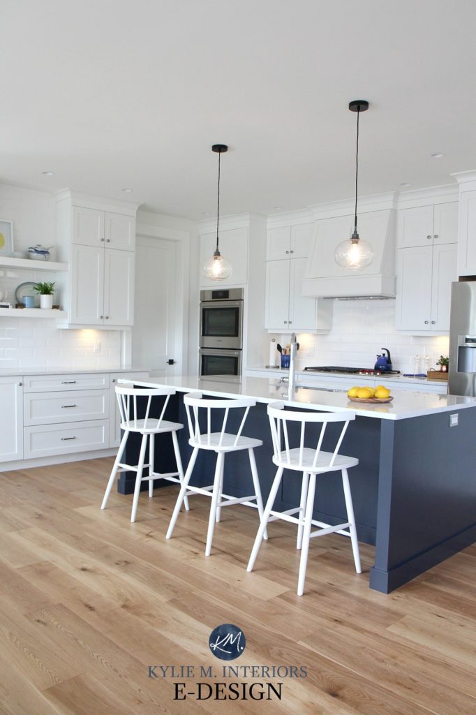
4. BENJAMIN MOORE BRITTANIA BLUE 1623
Not all blues need to be dark. I felt this way when choosing a new paint color for our island at our lake home…
While navy blue is more classic, I wanted a softer approach, one that I found with Britannia Blue. This shade has an LRV of 18.06, so it’s well out of the navy blue range while still showing up to the party with bells on.
![]()
The Best Blue-Gray Paint Colors
How to Choose the Best Blue Paint Color
5. BENJAMIN MOORE CHEATING HEART 1617
Be still, my Cheating Heart. Wait…that’s not how it goes, but it SHOULD be because of how gorgeous this color is! Cheating Heart is a wicked dark shade of navy blue, heavily grounded by gray and black. And while you’ll certainly be left with some blue on the table (or on your island, that would be more the point), it’s not overly committed or overwhelming.
This next kitchen island with a granite countertop shows Cheating Heart at its very…very lightest, as it’s being hit with a good whack of light…
FULL Paint Color Review of Benjamin Moore’s Cheating Heart
This next photo is a bit more typical of Cheating Heart and how it looks in the average home/lighting situation…
And because you should NEVER pick a paint color without comparing it to similar shades, you might also check out Benjamin Moore’s Wrought Iron or Deep Space.
By the way, the above concrete-looking countertop is actually affordable laminate!
6. BENJAMIN MOORE OCEAN FLOOR
Ocean Floor often gets passed over for the usual faves – Hale Navy, Newburyport Blue, and so on. However, this wicked shade of navy blue has a lot to offer.
Benjamin Moore Ocean Floor is in the medium-dark range, with its LRV of 14.13. What makes it a bit different from the usual bunch is that Ocean Floor is smokey, with a moody vibe (compared to the slightly more nautical, cheery look of Hale Navy/Newburyport Blue). This means that Ocean Floor is a great way to ‘commit to blue’ without going overboard (pun intended via the previous ‘nautical’ reference).
On the other hand, compare Ocean Floor to the previously mentioned Cyberspace, and you’ll see a blue that’s LIGHTER and a bit more committed to its blue than you might’ve thought!
Trendy & Popular Paint Colors for Your Kitchen Island (MIXED BAG!)
THE 4 BEST TEAL-INSPIRED PAINT COLORS FOR CABINETS
I wasn’t going to include teal in this blog post, as truth be told, it’s not that popular on cabinets (or islands). However, there are a few fans out there, so I thought I’d at least hit first base. This being said, if you’re hoping for a rip-roaring shade of teal, you’ve come to the wrong place.
Why?
Most kitchens don’t want to be painted a wild and crazy color – YOU might want it, but this doesn’t mean your kitchen agrees! This is why I’ve focused my suggestions on the more moderate, user-friendly end (if you want something more personalized and fun, check out my CABINET E-DESIGN PACKAGES!)
In order to paint your island or cabinets teal, your kitchen would ideally have the following:
- white or wood main cabinets
- white, black, off-white, gray countertops OR butcher block countertops, although there are a few exceptions
- there are also a few granites from the ’90s and early 2000s that can work well (update ideas for that era HERE)
- white subway tile or a backsplash/floor tile with green/teal in it that is the same type of green/teal as your island color
- if your countertop has a mix of warm tones, the chances of pulling off a brighter teal are pretty slim
The Best Blue-Green Blend Paint Colors
1. BENJAMIN MOORE DARK PEWTER 2122-10
If you can’t decide whether to commit to a strong teal or want something with a bit more softness, Dark Pewter could hit the spot.
With an LRV of 10.79, Dark Pewter offers a very modest approach to teal with less color and more gray. This fabulous shade is often missed as it’s tucked in the Color Preview Fan Deck. However, in the right kitchen, it can be the perfect touch.
If you’re looking for an even more muted look with these gorgeous blue-green undertones, check out Sherwin Williams Roycroft Pewter…
2. BENJAMIN MOORE BELLA BLUE 720
Bella Blue is as pretty as she sounds. With a perfect blend of blue, green, and gray, Bella Blue has just the right saturation to make a statement without overwhelming the average palette. But again, because I only use photos from my readers and Online Color Consulting clients, I don’t have the photos I need. HOWEVER, check out how gorgeous it is on this front door…
Bella Blue can look like it caters to blue but overall settles as a super well-balanced teal. With an LRV of 17.5, it tiptoes into the medium-dark range without adding too much visual weight.
3. BENJAMIN MOORE KITTY GRAY 1589
With its blend of green, blue, and gray, Kitty Gray is a great way to make a statement without going over the top with color. While Kitty Gray does cater a bit more to green, it’s heavily grounded by gray and has blue mixed in for moderation. Compared to the others, Kitty Gray is DEFINITELY more neutral, but it doesn’t quite dip its toes in the gray pool!
4. SHERWIN WILLIAMS RIVERWAY
My favorite of the bunch (yes, I play favorites) is Riverway, a gorgeous approach to teal. With enough blue and green to make a point but a solid dose of gray for good measure, Riverway makes a stunning statement without being overly bossy…
READ MORE
The Best White Paint Colors for Cabinets, Trims or Walls
Farrow & Ball’s 10 Best Blue Paint Colors
Trendy & Popular Paint Colors for Your Kitchen Island (MIXED BAG!)
How to Choose the Best White Paint Color for your Cabinets
The 12 Best Navy Blue Paint Colors for Cabinets, Islands, Front Doors & More
The Best DARK Greige & Taupe Paint Colors
LET ME PICK YOUR BEST COLORS FOR YOU!
Check out my Online Color Consulting packages; I’d love to help!
Chat soon,

ORIGINALLY WRITTEN IN JULY 2019, UPDATED IN 2024
Comments
Leave a Reply
More Posts

The 5 Best Creamy White or Off-White Paint Colors
THE ELUSIVE ‘CREAMY WHITE NEUTRAL’ When it comes to light, warm neutrals, it’s all in the undertones. And other than pink and green, yellow is the undertone many of my
Read More

The 8 Best Warm Neutral Paint Colors With NO Yellow Undertones!
The Top Light Depth, Warm Colors That Aren’t Cream! When choosing the best warm neutral paint color for your home, whether creamy white, beige, taupe, or greige, your choices are
Read More

The 12 Best Farmhouse Sinks of 2024
FIND YOUR DREAM SINK HERE… While traditional farmhouse design was all the rage in previous years, the embers have definitely cooled. As for MODERN farmhouse, it’s still kickin’ its cowgirl
Read More


I’m doing my walls in SW Alabaster but was thinking about my cabinets and trim in PPG Delicate White. I want a very shuttle difference .
I’n my powder room I am thinking about SW Black Magic for the vanity. Your thoughts?
Author
Hi Dianne, I’m just not familiar with the PPG brand to really put those all together, but if it were me, I wouldn’t do a different white on the trim and a different one on the cabinets, as they will only expose each others undertones – I would stay consistent and do the same for sure.
Hi Kylie, regarding the different tones — I had just about decided to do my house trim SW pure white but upper cabinets BM white dove. (I was planning to use SW throughout the house except cabinets.) Would that be a problem?
Author
You know, a lot of people will do it. Would I? Nope. I’d worry too much that the White Dove trim, being not as warm as White Dove would look a bit dingy in comparison, and that in turn White Dove would look a touch yellowed. Whereas when they’re the ONLY whites, they level out quite nicely!
I love these colour ideas Kylie! I will contact you when I replace my cabinet doors in the kitchen.
I can’t tell you how relieved I am to see this post!!! I’m having custom cabinetry done for our master bathroom and chose BM White Dove. As I often do, I start doubting my choices after searching the web for anything on White Dove which leads me to comments about it being(or turning) too yellow or too creamy, which i didn’t want. Any insight on that? I loved it’s look when i was at the cabinet shop due to it’s softer appearance. I’m planning on using it on all the trim since the crown molding around the top of the linen closet/cabinet is the same as the cabinets. I’m doing a white subway tile shower with almond color penny tile on shower floor and Marazzi Lounge 14 in cosmopolitan color. Would you go with white dove on the walls or add a neutral color? I’m stuck at that point. The bathroom faces N/NE.
Author
Hi Lisa! Well I know that I wouldn’t put another white in the mix with White Dove, I’d keep going with that so if you want white walls, stick with White Dove. And it can be a warmer, creamier looking white, but it’s more subdued than the others (Cloud White for example). You might notice the warmth of it a bit more up against a pure white subway tile, which is why I ‘might’ consider a neutral on the walls, just to break things up a bit :).
Great Post Kylie! But none of these beautiful colors will work for me. I have a travertine floor that was put in my bathroom
in the 90’s. It has a creamy undertone that leans a bit yellow (I think!) or maybe it is pink beige. The floor has to stay because the shower is also travertine and the shower has 2 clear glass panels. My wall color looks nice and is SW Patience. The problem is the oak vanity (medium brown) and it kind of ugly. Thought I should paint it since it is still in okay condition and get new hardware. I have beautiful brushed gold Kohler faucets that are fairly new. If I paint my vanity some shade of white, will that work? Or should it be the color of my walls? I’m thinking the vanity should be white, but it has to be the right undertone because of the travertine floor. The current countertop is travertine tile but that is going to go and I’ll get quartz with new undermount sinks. I’m doing everything to update this bathroom to a more current look because we want to downsize and sell in a few years (we are empty nesters!) Thanks for any help can offer.
In general -What are the best vanity colors with beige countertop? that countertop is like bone in my throat… do I need to repeat counter color in Shower accent in mostly white the bathroom or just ignore it !
We recently painted our bathroom in SW Essential Gray and want to paint our vanity. Our cermaic tile floor is tan and tub tiles are a lighter shade of beige. Vanity top is off with with light splashes of beige. Can you recommend a color for our vanity? Thank you!
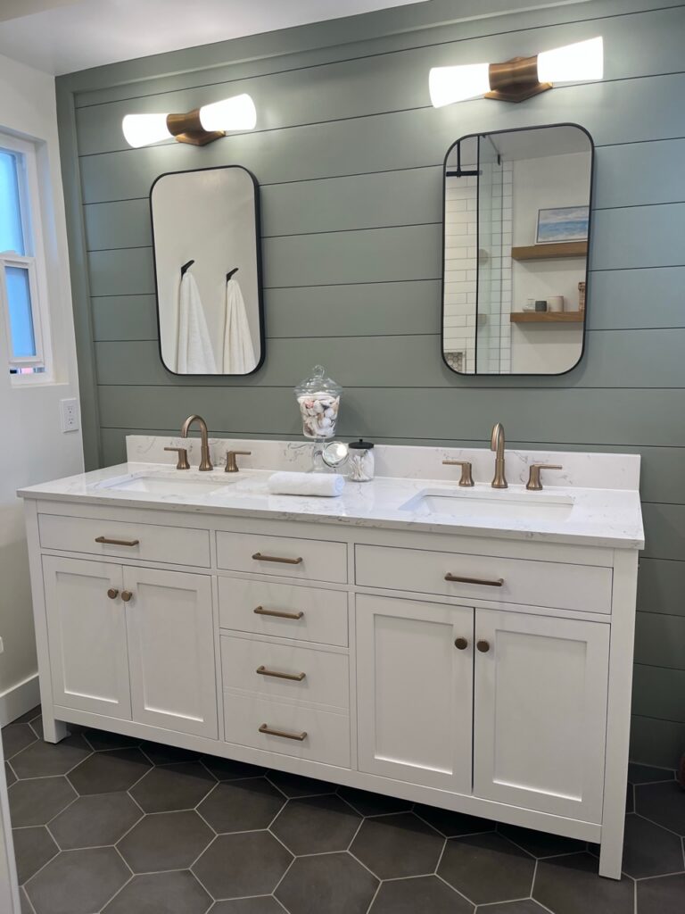
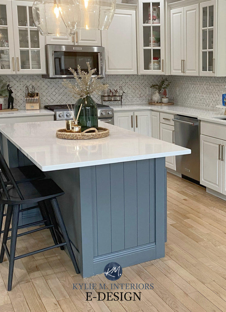
Hello, Is the green on the vanity in the picture above Isle of Pine? If not, what is the name and manufacturer? Thank you
Author
You bet it is!
Hello! What SW griege is used in the photo with the arrow print and white knobs? I don’t think it’s urban bronze. Thanks 😊
Author
Ahhh, that’s Benjamin Moore Kingsport Gray 🙂
Boy is that Agreeable Gray makeover beautiful in the last picture! Nice work!